PRM Hypothesis validated · +22% in sales · CMS in development
SBT Prêmios & Massa Prêmios — From TV to Pix with less friction, and a CMS that governs the brands
On SBT Prêmios, we adjusted the old layout to validate a lower-friction journey; the rebranding of both brands and the CMS/Admin continue in delivery.
+22% sales last month, after slimming the journey on the old SBT Prêmios layout
PRMThe fronts and the CMS
From TV to Pix, and from the operation to the brand.
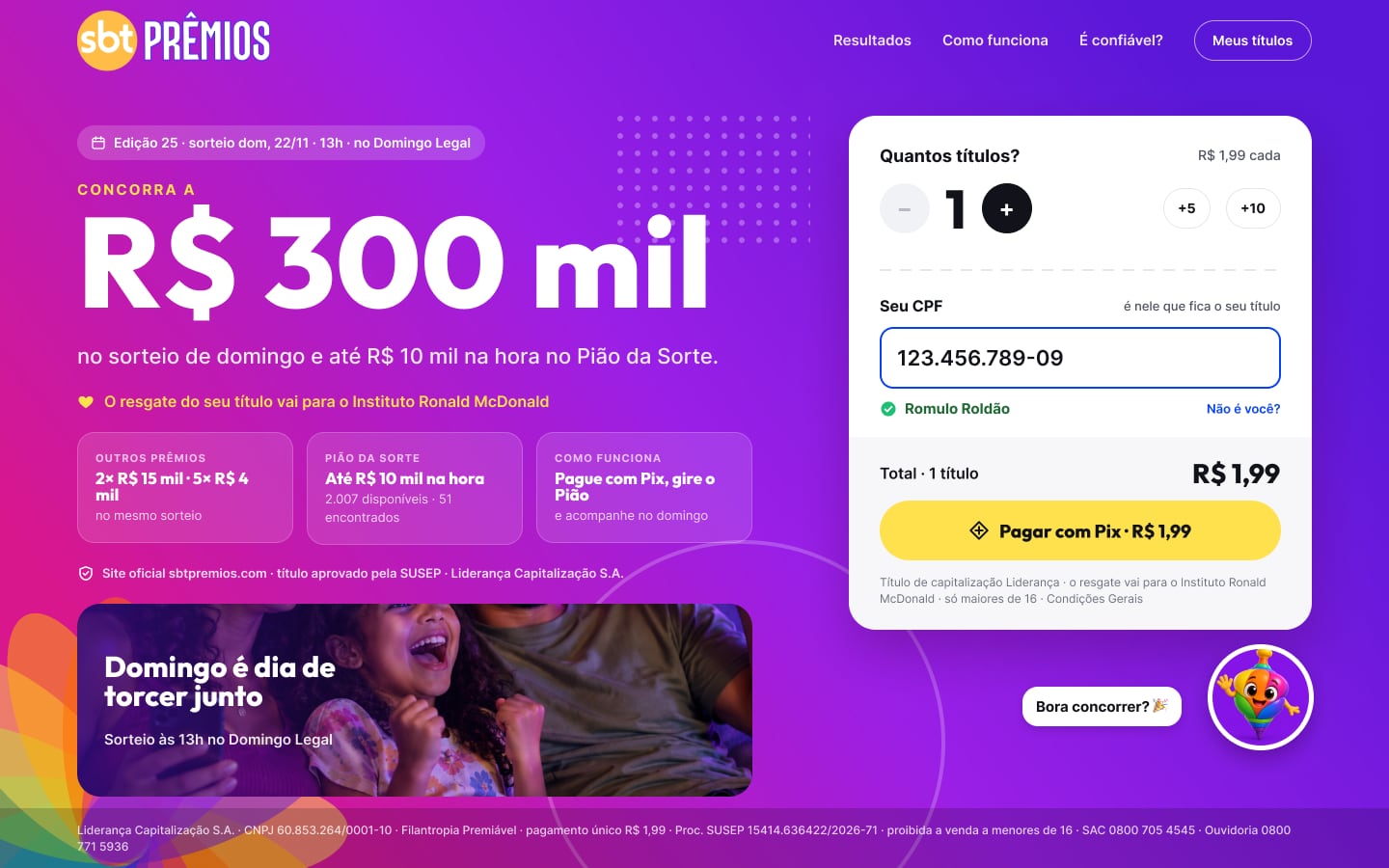
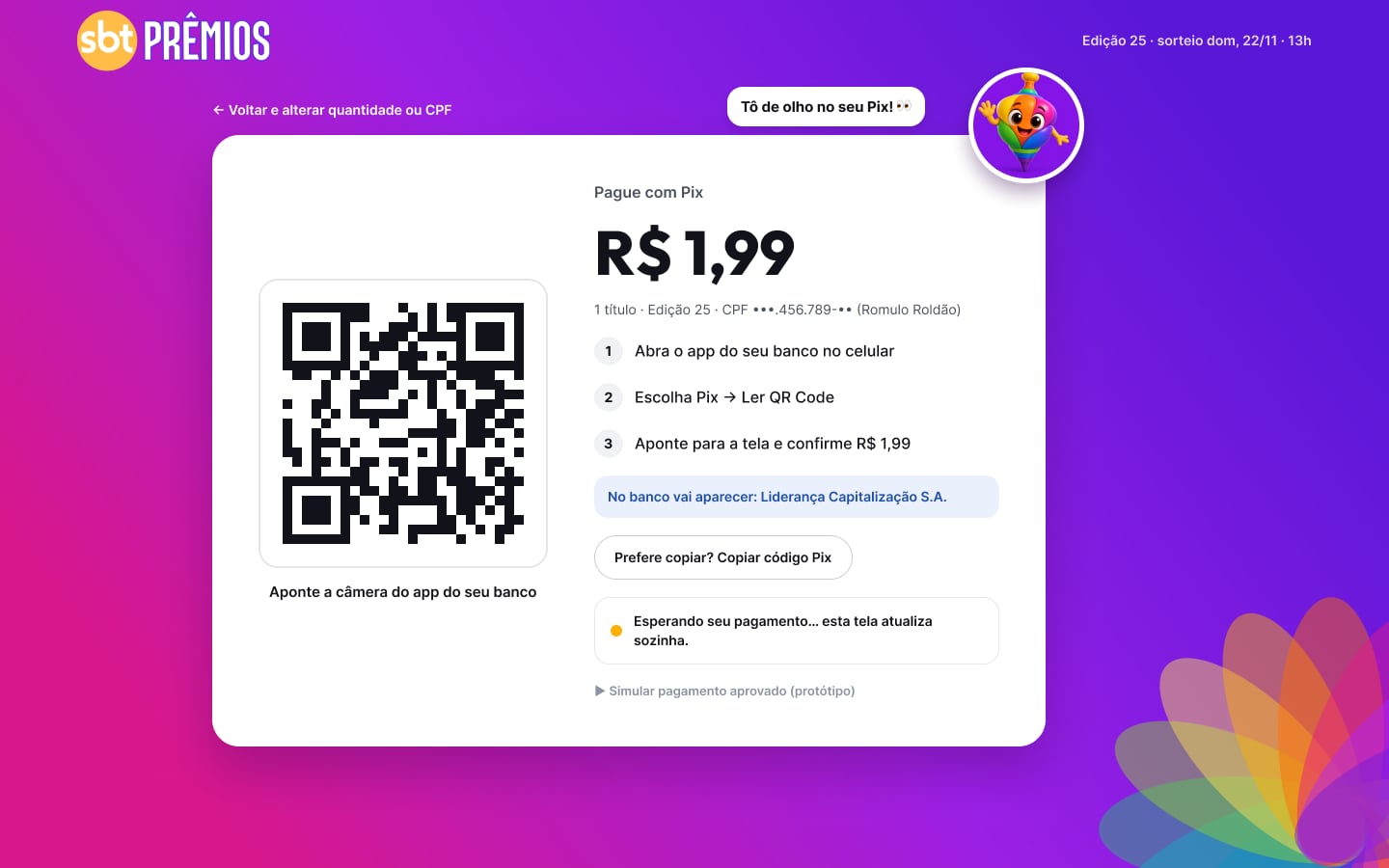
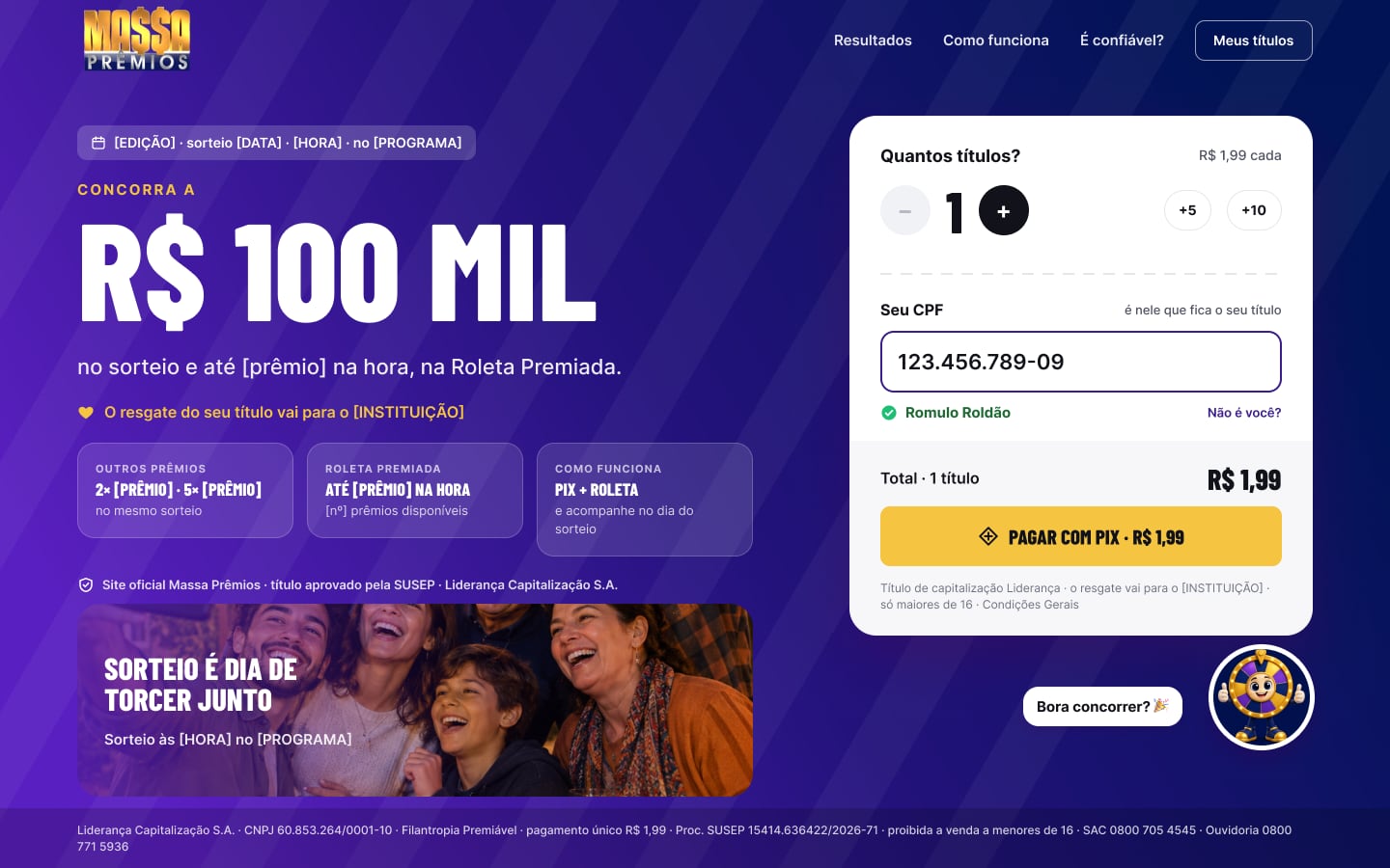
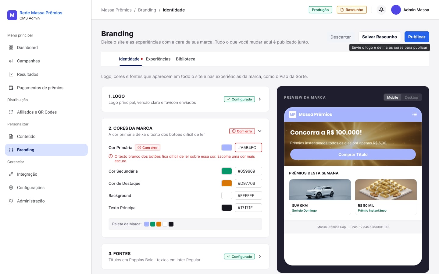
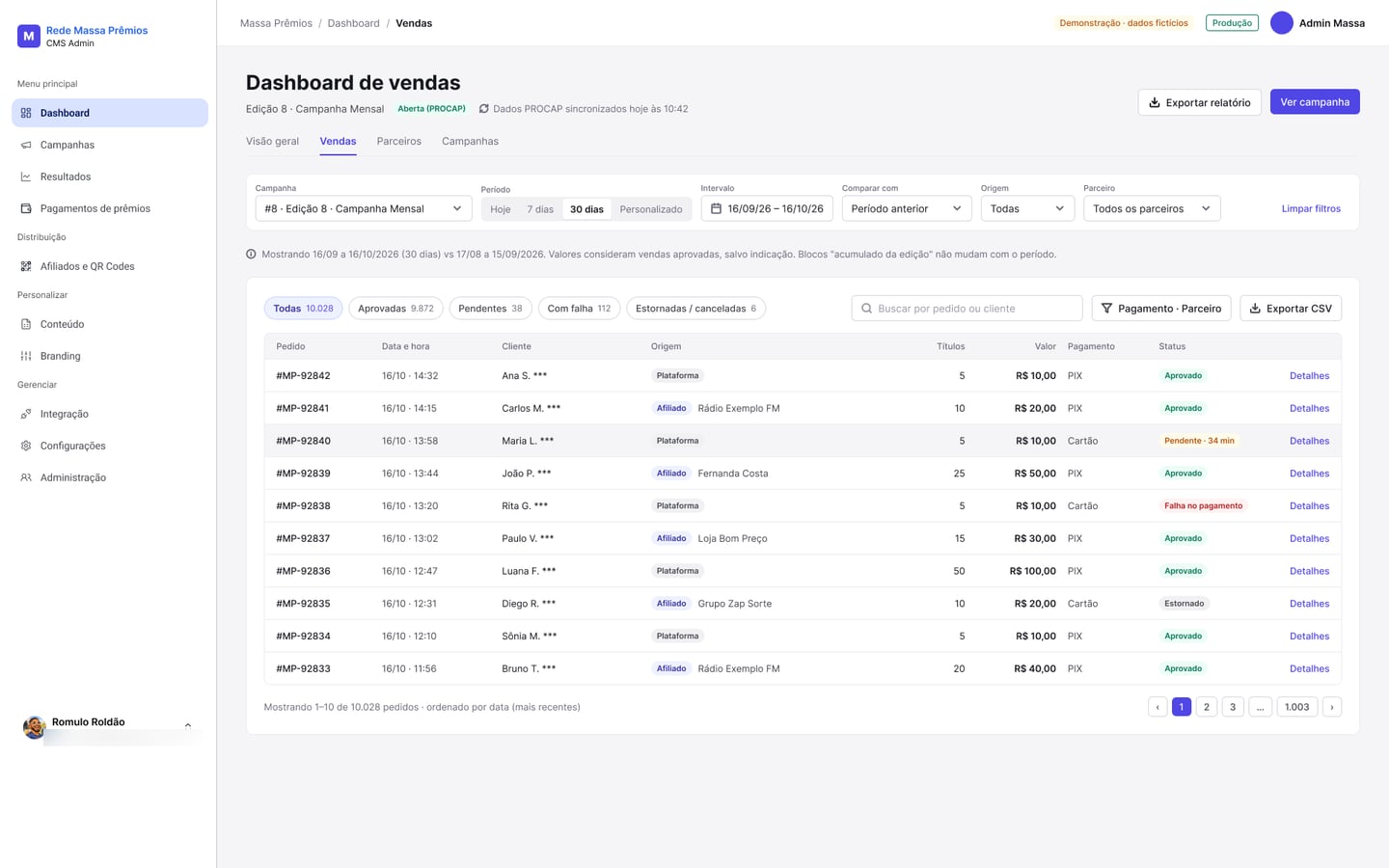
On SBT Prêmios, the lean journey was validated on the old layout (+22% sales last month). Screens of the rebranding and CMS/Admin in delivery; Admin data is fictitious and emails were blurred. The interface is in Portuguese.
Context
SBT Prêmios and Massa Prêmios are prize-linked charity products from Liderança Capitalização, sold in partnership with the SBT and Rede Massa TV networks: a R$ 1.99 title paid with Pix, a draw on TV, and an instant prize on the Pião da Sorte spinner or the prize wheel. Each title's redemption goes to a charity. The sale starts on live TV: people see the QR code on screen and have seconds to buy.
Problem
In the Massa Prêmios audit, buying took 6 taps and 6 fields before Pix — far from the pace of a TV call to action. The two brands were evolving separately, and the operation needed developers to change brand, content, and campaigns. The challenge: shorten the purchase without running over regulation, and give the operation autonomy without breaking consistency.
My role
Product Designer responsible for rebranding the SBT Prêmios and Massa Prêmios fronts — audits, benchmark, experience architecture, visual direction, a package for Legal, and a decision log — and for ideating and prototyping the whole CMS/Admin. On SBT Prêmios, I prioritized validating the lean journey on the old layout with the engineering team, before the full rebrand; regulatory rules are Legal's decision.
Decisions
North-star metric: time from QR to copied Pix. Adjust the old SBT Prêmios layout to validate lower friction before the full rebrand. Buying without a password, with an optional account after payment (proposed, waiting on Legal). Separate the participant product from the operations product. A “Stage & Counter” visual concept: the brand expresses itself on the stage; the purchase counter is neutral, with AA contrast. A multi-brand design system: tokens, a brand-expression layer, and domain components. In the CMS, the operation sets up the brand with validation — a color without enough contrast blocks publishing.
Solution & artifacts
Screens and project details.
A stage for the brand, a counter for the purchase
The purchase starts from a QR code on live TV. That is why the experience splits into two spaces: the stage, where the brand expresses itself — color, mascot, prize — and the counter, where the person pays, neutral and readable. Both brands share the same counter; only the stage changes. On SBT Prêmios, the lower-friction hypothesis was tested first on the old layout; the full rebranding and the CMS/Admin continue in delivery with the engineering team.
- Fewer steps — from 6 taps and 6 fields before Pix to a lean purchase, with extras only after confirmation.
- Proof on the old layout — on SBT Prêmios, the lower-friction journey raised sales by 22% last month.
- One base, two brands — shared tokens and components, with a brand-expression layer; a CMS with rules the operation does not have to remember.
Front, design system, CMS
-
Brand front
- the edition's campaign
- details
- Pix
- done + spin or wheel
Decision: a lean purchase, from QR to Pix
-
Design system
- tokens
- brand expression
- domain components
Decision: two brands on one base
-
CMS/Admin
- branding with validation
- content and campaigns
- sales and affiliates
Decision: the operation governs the fronts
What we discarded
Problem
In the Massa Prêmios audit, buying took 6 taps and 6 fields before Pix — far from the pace of a TV call to action. The two brands were evolving separately, and the operation needed developers to change brand, content, and campaigns. The challenge: shorten the purchase without running over regulation, and give the operation autonomy without breaking consistency.
Validated result
On SBT Prêmios, the lower-friction journey on the old layout raised sales by 22% last month. The full visual rebranding and CMS/Admin continue in delivery.
Tensions
- Brand × a clear purchase
- Speed × regulation
- Operational autonomy × consistency
- Two brands × one base
Impact
On SBT Prêmios, we adjusted the old layout to test the hypothesis that a lower-friction journey would increase purchases. The hypothesis held: sales rose 22% last month. The full visual rebranding of both brands and the CMS/Admin continue in delivery with the engineering team. The north-star metric (time from QR to copied Pix, target up to 30 seconds) remains the evolution north star; password-free purchase still depends on a Legal decision about the SUSEP rule.
What I learned
When the sale starts in a TV break, design is time: every field you remove weighs more than any illustration. Validating the hypothesis on the old layout, before the full rebrand, shortened the path from decision to proof.