TIM Case
TIM — Partner Portal
Restructuring a B2B portal that is critical for partners — less friction in the order, more clarity in the operation.
Sole PD on the consulting engagement — redesign of the order experience and the panels
TIMThe portal
Each area of the portal, with the real screen.
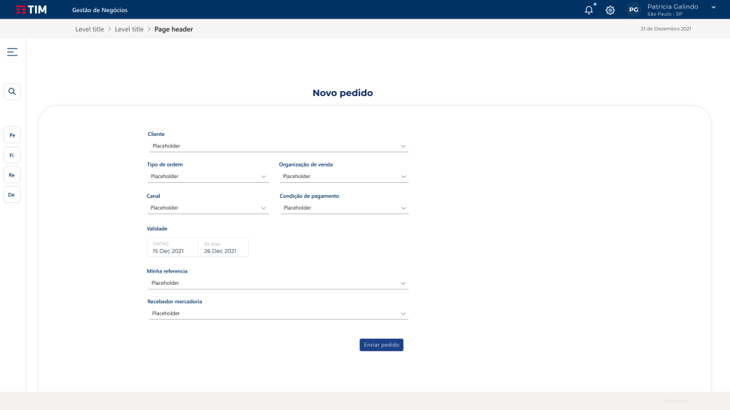
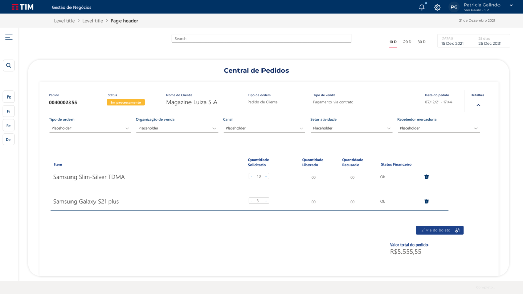
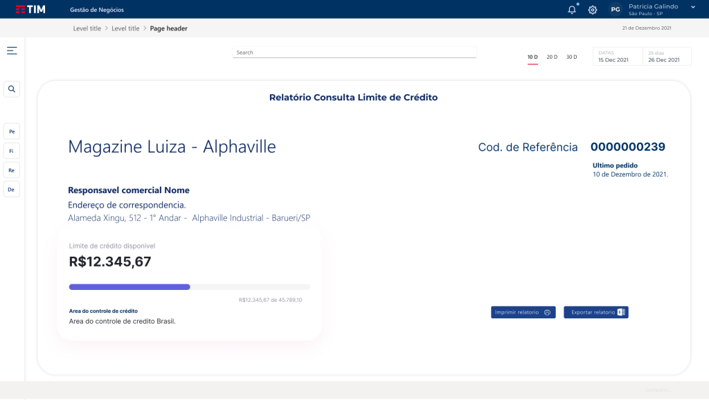
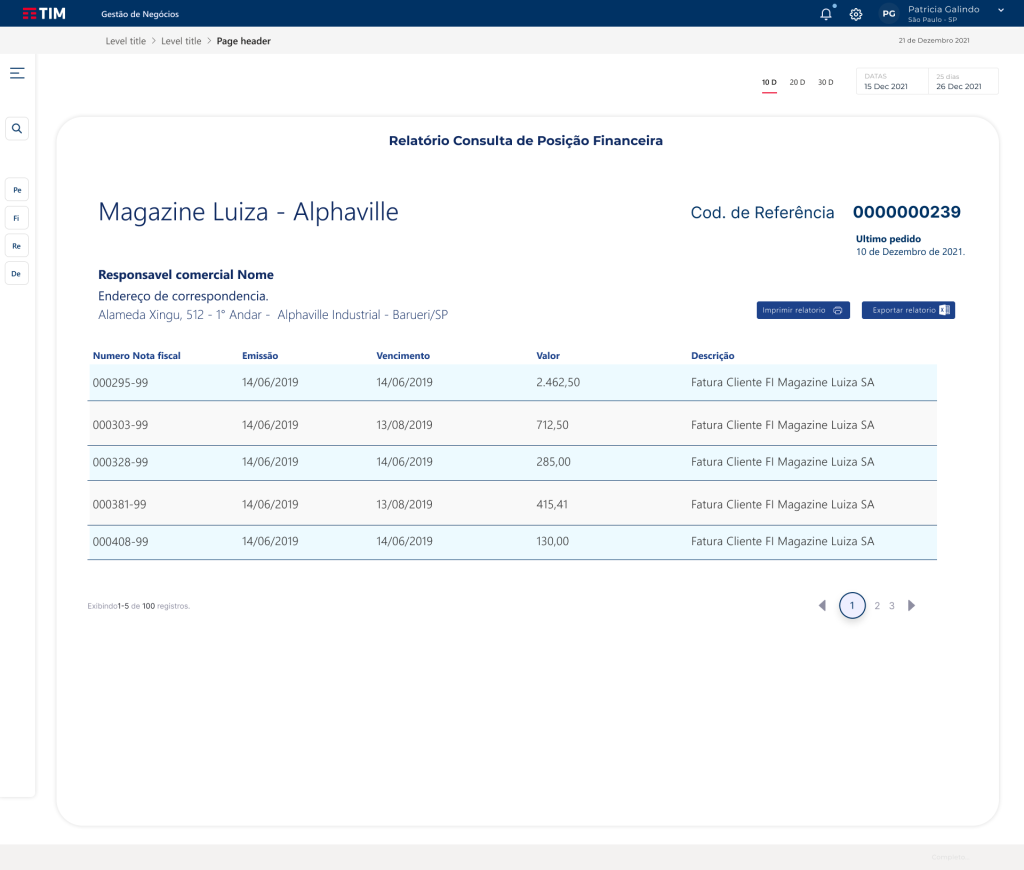
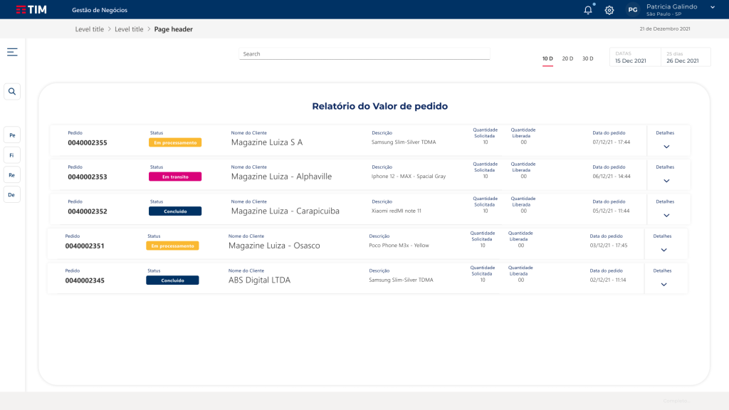
Screens from the redesign. Select an area to see the interface.
Context
A central B2B portal for device orders and credit quotas across the TIM partner network.
Problem
An old UI, a long flow, little transparency, and a high risk of resistance if the change was abrupt.
My role
I was the Product Designer for Engineering's consulting engagement at TIM — the only PD on the engagement.
Decisions
Modernize without breaking the flow; cut steps from the order; panels for status and credit.
Solution & artifacts
Screens and project details.
Modernize without taking the operation down
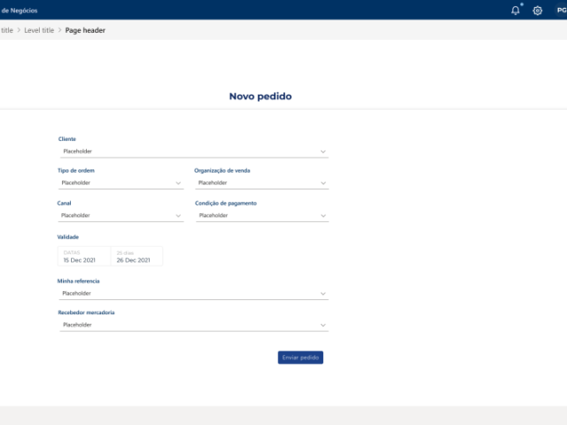
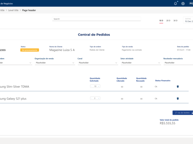
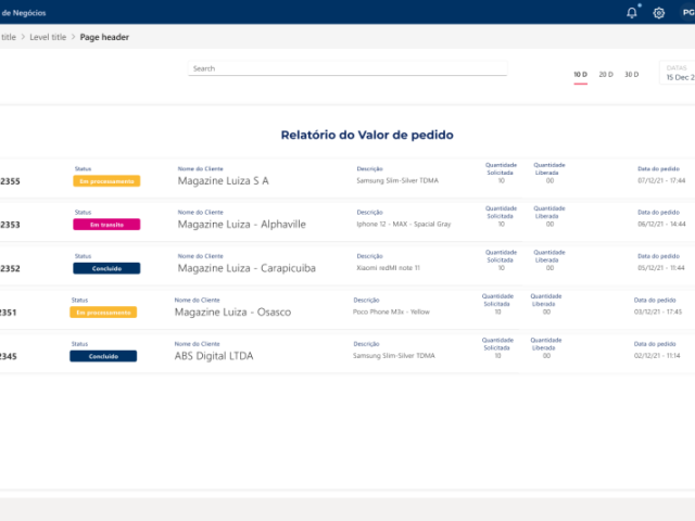
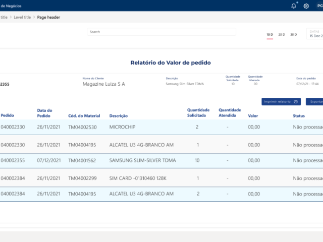
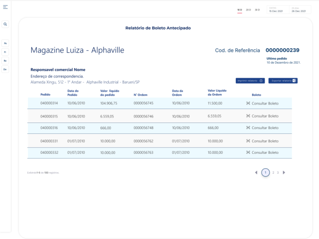
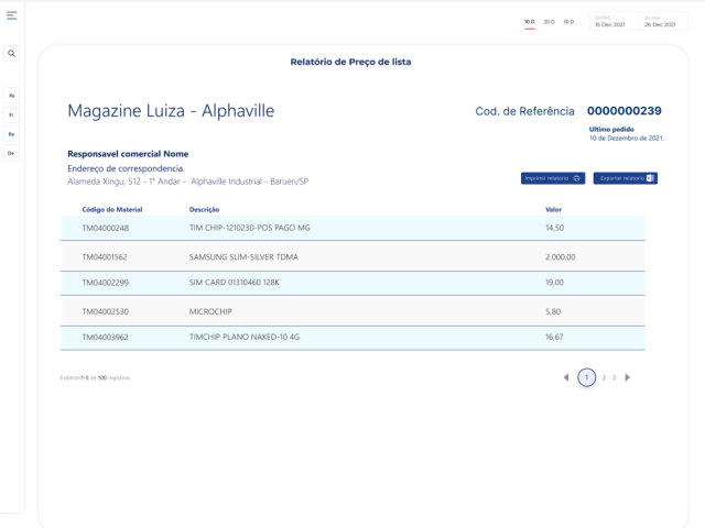
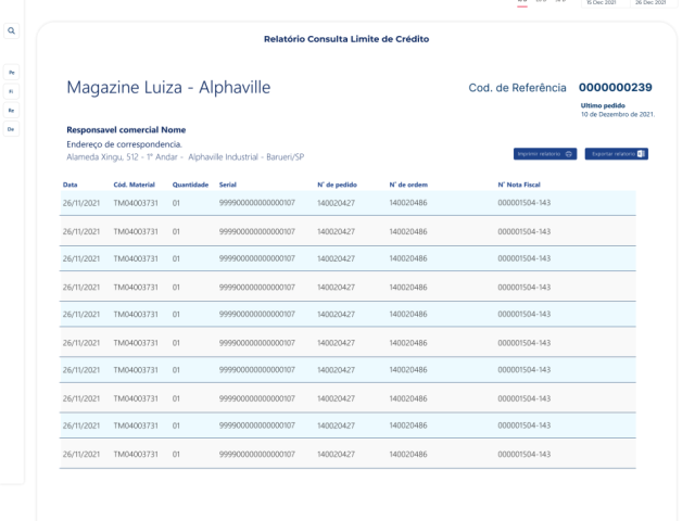
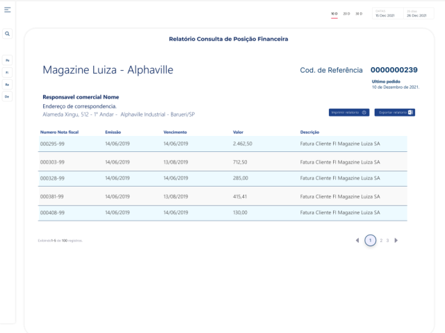
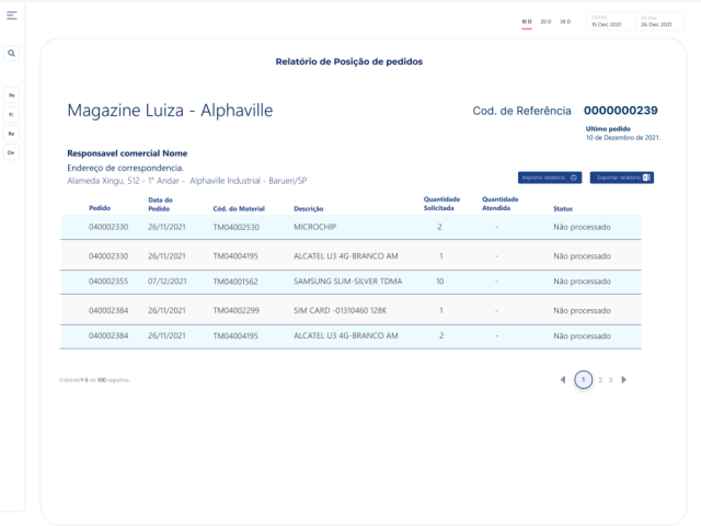
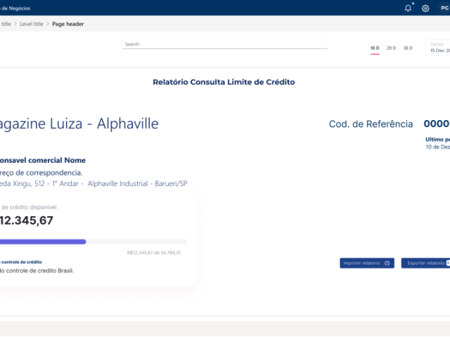
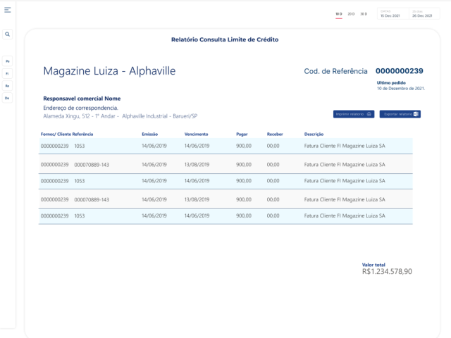
The solution favored a tighter order flow and status/credit panels — keeping the operators' mental model. Below, curated artifacts from the redesign.
- An order with fewer steps and less friction.
- Panels for value, boleto, serial, financial position, and credit.
- Operational familiarity over a radical cosmetic redesign.
What we discarded
Problem
An old UI, a long flow, little transparency, and a high risk of resistance if the change was abrupt.
Objective
Less friction in the order, faster adaptation, visibility of orders and credit.
Impact
Aims of the redesign: less friction in the order, faster adaptation, visibility of orders and credit. Quantitative results are not published here.
What I learned
In everyday B2B tools, the best redesign improves the work without destroying familiarity.